Westpac – Ted Talks
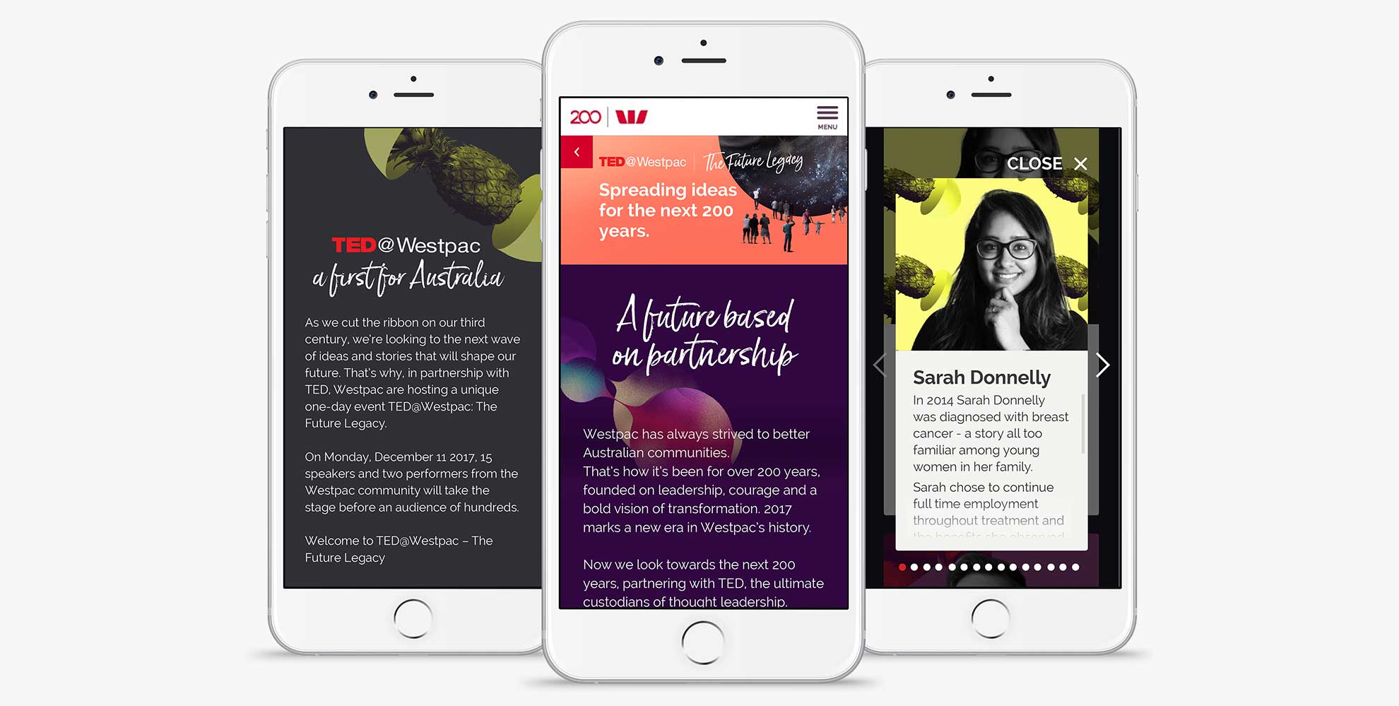
As part of the Westpac’s bicentenary microsite, a section was created to introduce the bank as the first company in Australia to a partnership with TED Institute. The idea was to promote it as the bank who explore ideas and stories that shape a more positive future for all Australian.
Role
- User interface design
The Approach
Despite the tight deadline, the team and I managed to leverage the existing assets to create a simple and pleasant responsive page, which featured parallax animation, a set of interactive cards for each of the Westpac speaker’s bios and a floating share bar on the right side to allow users easy access as they scroll.
Outcome
Fast and efficient project design, development and delivery in just 2 days.
Client comments:
“One of the trickiest project I’ve encountered at WP”
“I love it, that’s awesome work”.
Project credits
- UX lead/Head of art: Mark Seabridge
- Senior digital producer: Talha Ahsan
- Art direction: Saatchi&Saatchi Sydney
