Belong Design System
In 2019, Belong a division of Telstra embarked on its digital transformation journey, transitioning from building pages from scratch to implementing a robust Design System, to overcome the multiple challenges they were facing.
Belong faced several challenges, including:
- Changes to the website took weeks to implement, which reduced team efficiency and increased the cost of resources
- The absence of visual design consistency caused customer confusion and decreased conversion and retention rates
- Limited brand recognition within the market
- Not able to effectively respond to market needs on time.
I played a crucial role in creating and maintaining the Belong Design System, a scalable and accessible shared language that provided visual consistency across different digital platforms.
The approach
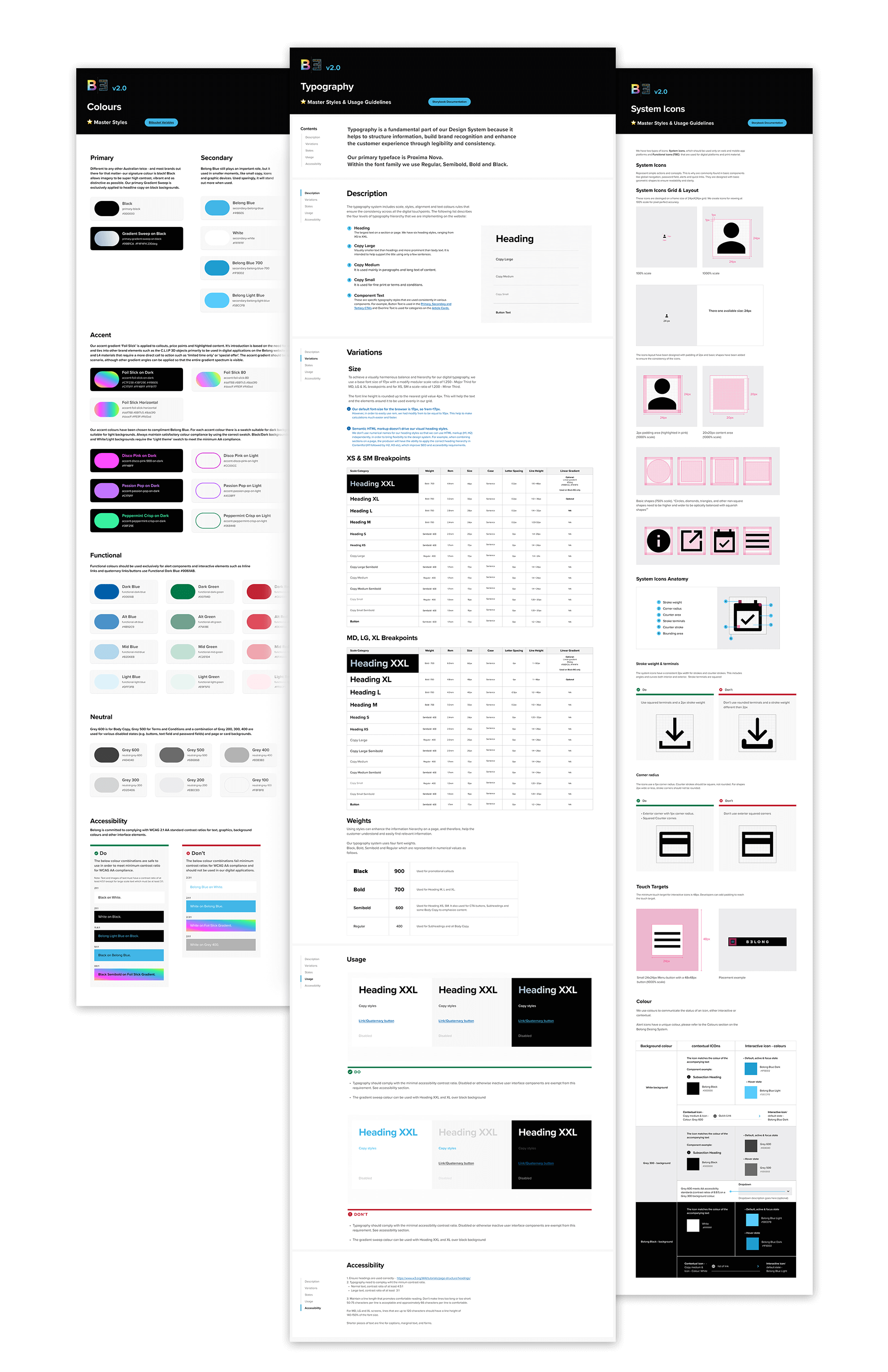
Following a design audit of the existing UI patterns, my team and I developed a UI/UX library using an “atomic design approach” and prioritising mobile-first design principles.
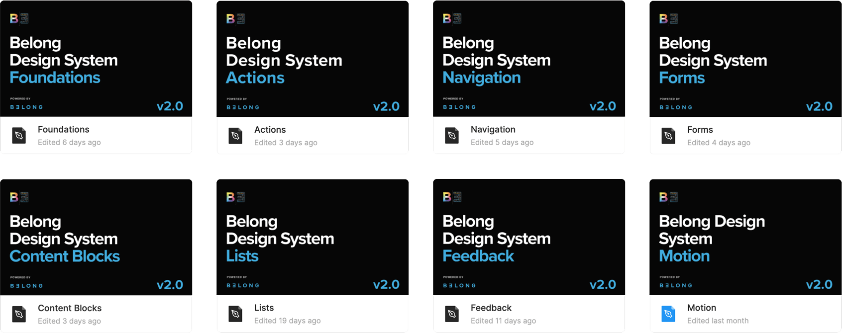
First, we created the foundations, including typography, colours, buttons, system icons and grid, followed by more complex components implemented on our headless CMS Contentful platform.
Components
We developed and implemented approximately 65 components that adhered to design principles and met accessibility standards.
Master component
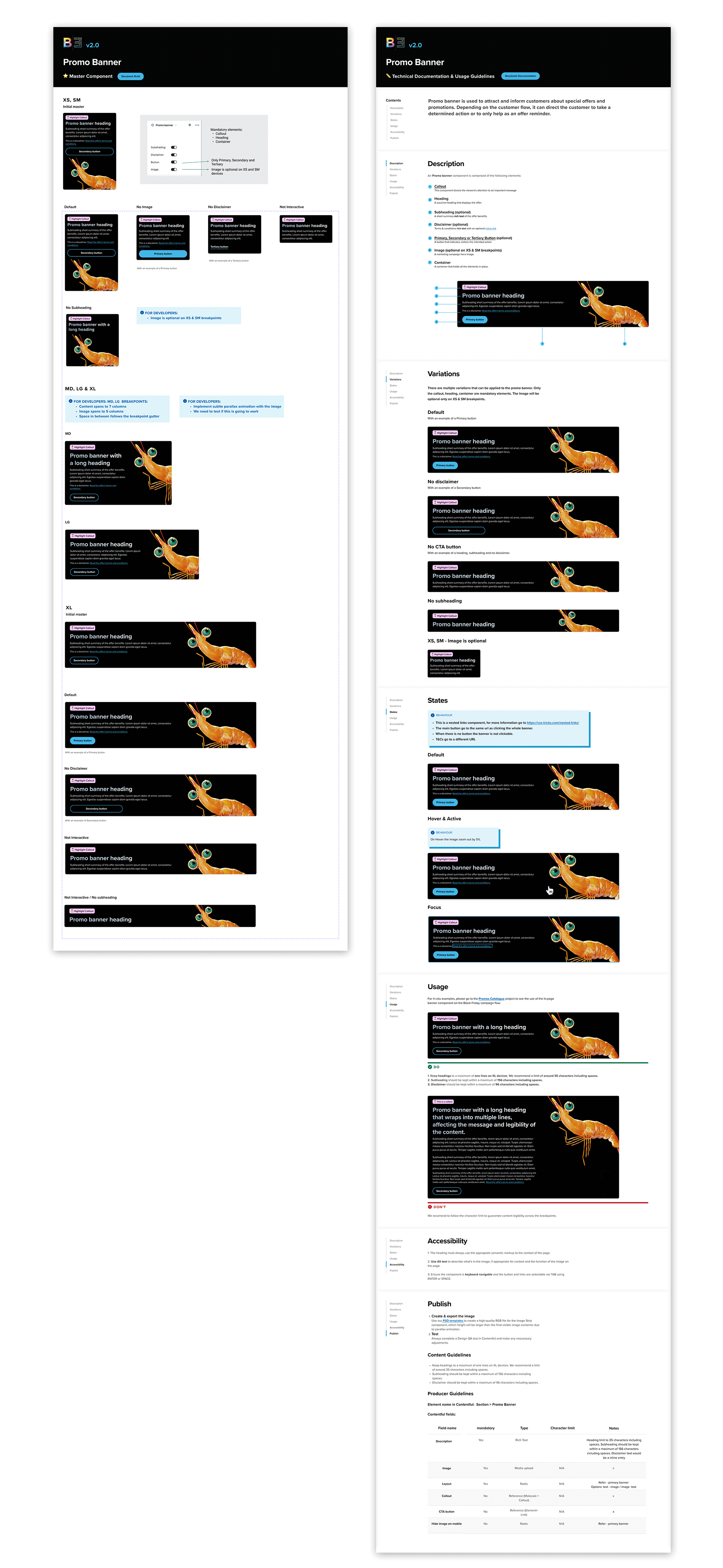
I developed a series of master component pages in Figma, which served as a centralized resource for designers and developers.
- Designers had the ability to rapidly modify master components, resulting in automatic updates to all linked instances across multiple projects
- Developers used Figma to measure and inspect components, extracting essential information such as spacing, sizes, and code details.
Documentation & Usage Guidelines:
These components were meticulously documented in Figma, providing a comprehensive reference for the agile team and the broader business. The document included the following sections:
- Description
- Variations
- States (If applicable)
- Usage – UX/UI recommendations do’s and don’ts
- Accessibility
- Publish – Assets, content and production guidelines.
Navigation Component
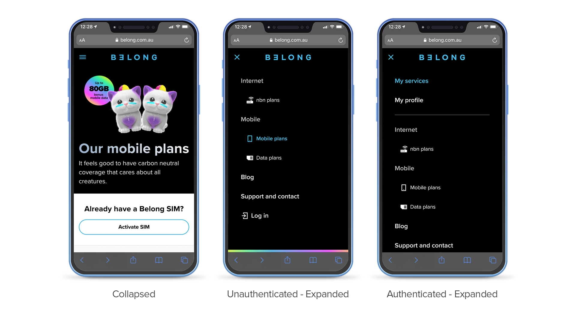
My latest work at Belong was to uplift the primary navigation to ensure scalability and meet the growing needs of the business.
How I did it
- I designed and implemented a mega menu for unauthenticated authenticated user flows
- Subtle interactions were introduced to enhance the user experience, provide visual feedback, and engage customers.
Pages & flows
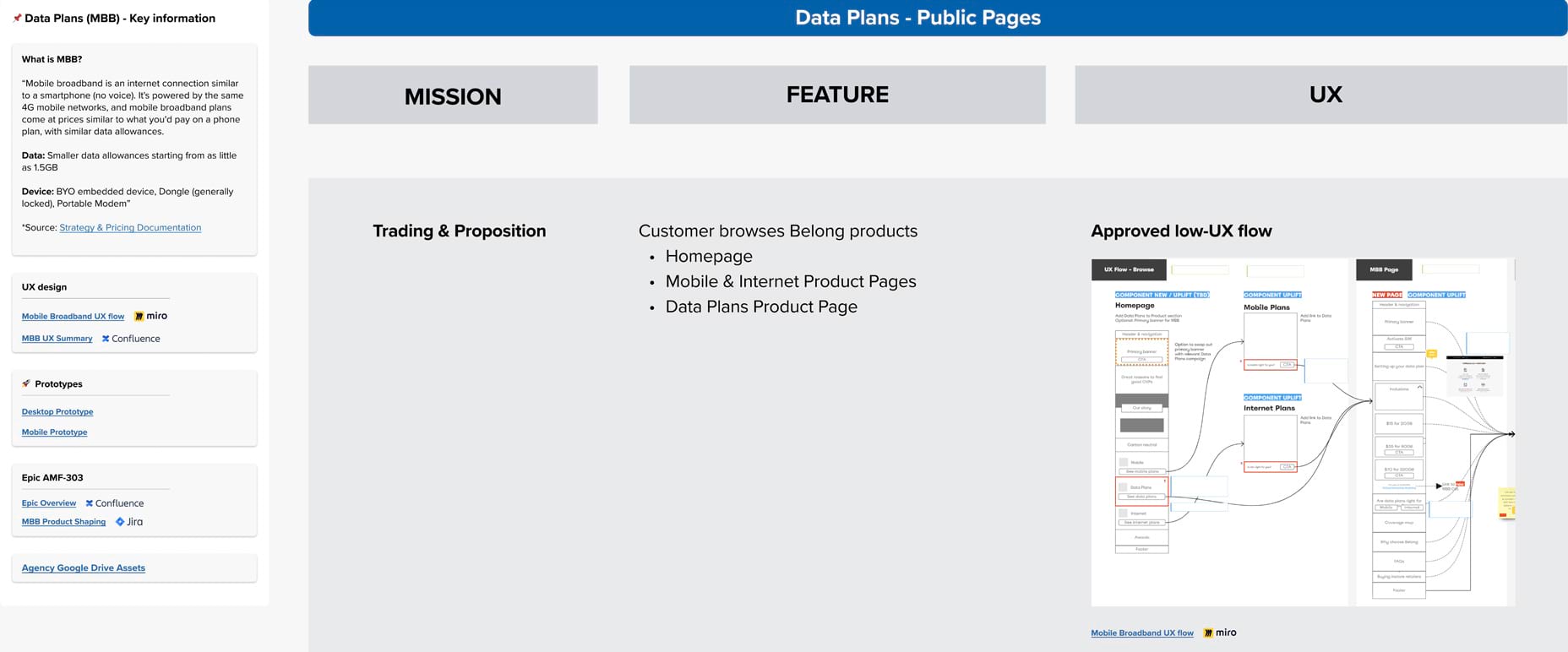
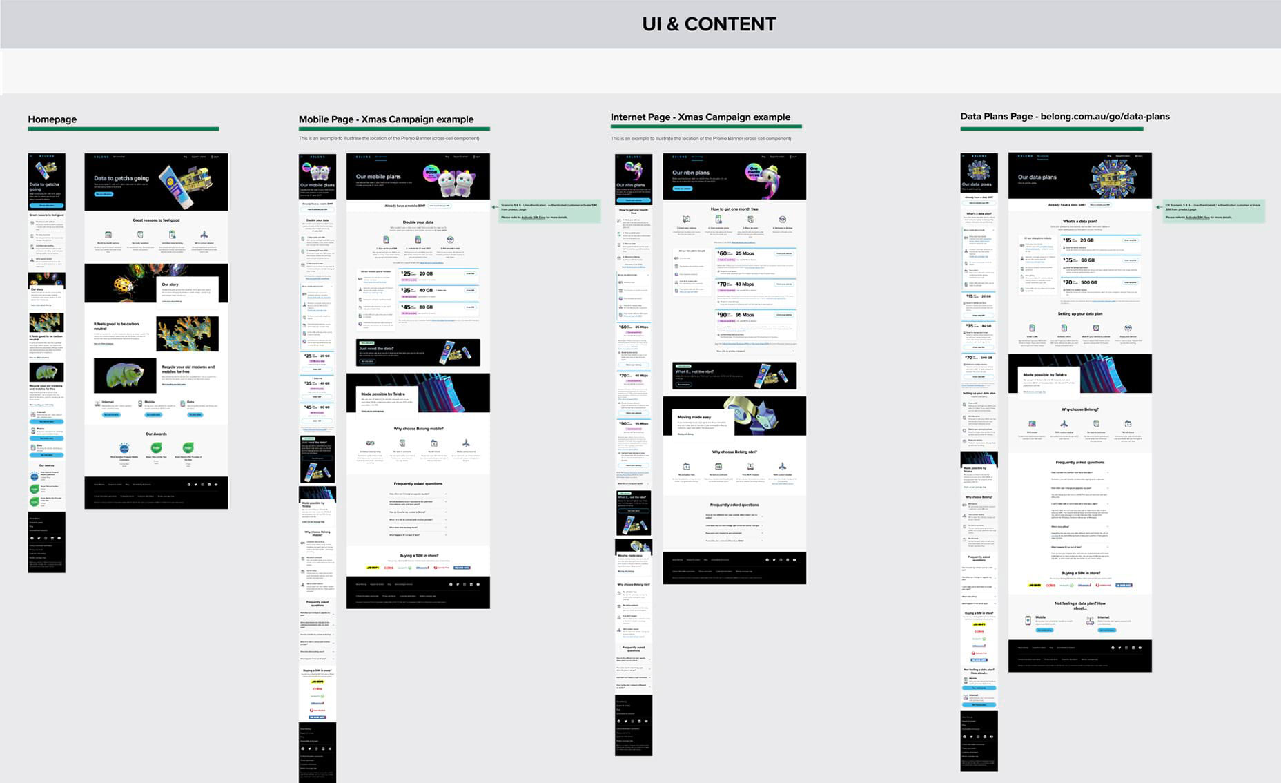
I worked with the team to deliver order-to-activate flow’s initial iteration for Belong mobile service. Additionally, I created and implemented most of the components for Belong’s public/unauthenticated pages and worked closely with the marketing and advertising agency to create compelling campaign landing pages to drive sales and brand awareness.
Outcome
- Successfully implemented a web/app brand refresh in a remarkable two-week timeframe, which involved new assets and conducting thorough compatibility testing across browsers and devices. The outcome was an achievement of business goals and enhanced brand and user experience.
- Actively explained to the broader business the value and efficacy of the Design System. This work allowed the experience design team to improve design solutions and drive adoption across different teams.
- With the aid of the Design System, we successfully tailored experiences for our customers and conducted A/B testing using Optimizely to validate hypotheses. This strategic approach enabled us to achieve higher conversion rates and significantly enhance the overall customer experience.
Project Credits
- Experience design chapter
- Belong agile missions
- Broader business and stakeholders
