Officeworks - Campaign Landing Pages Optimisation
Officeworks was looking to create a flexible campaign landing page template for its major campaigns, with the objective to drive sales and generate customers engagement.
Some of the main challenges they faced:
- Many call-to-actions (CTAs) and messages to communicate, which were leading to clutter
- Product components, struggle to display the wide range of products/categories and subcategories
- Design & UX, the design felt blocky and cluttered
- Some of the components were not performing as expected in terms of revenue and engagement.
Role
- UX research
- User interface design
The Approach
The task was to create optimised landing pages for three key Officeworks campaigns – Back to School, End of Financial Year and the Christmas Gift of Creativity.
Discovery & Definition Phase
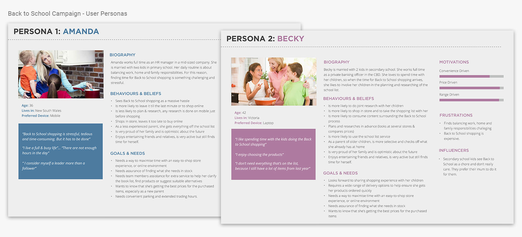
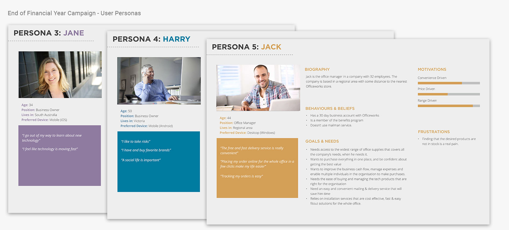
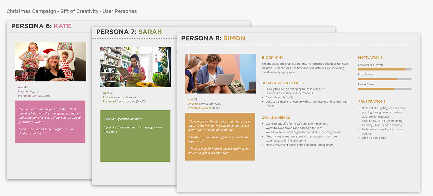
Due to the project timeline and budget, we could not conduct primary user research. Instead, we reviewed the existing documents and CRM data, and created eight ‘personas’ for the three main campaigns to understand the customer needs and behaviours.
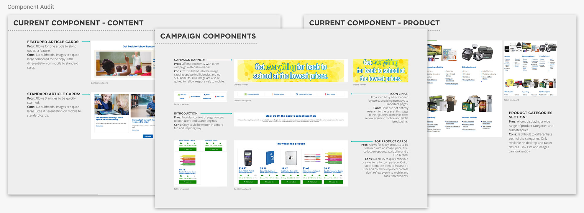
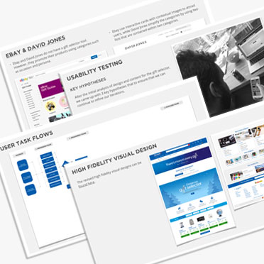
Then, the team and I organised a component audit to look at existing elements and evaluate their performance against the business requirements. Followed by a competitive review to identify what worked in terms of functionality, content and layout.
Development Phase
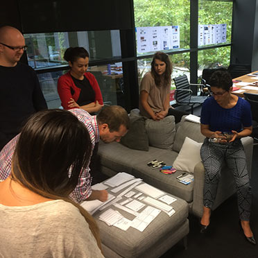
We created paper prototypes with a wide range of UI components. This material and the previous research were presented to the client in a collaborative workshop to understand the hierarchy of each campaign.
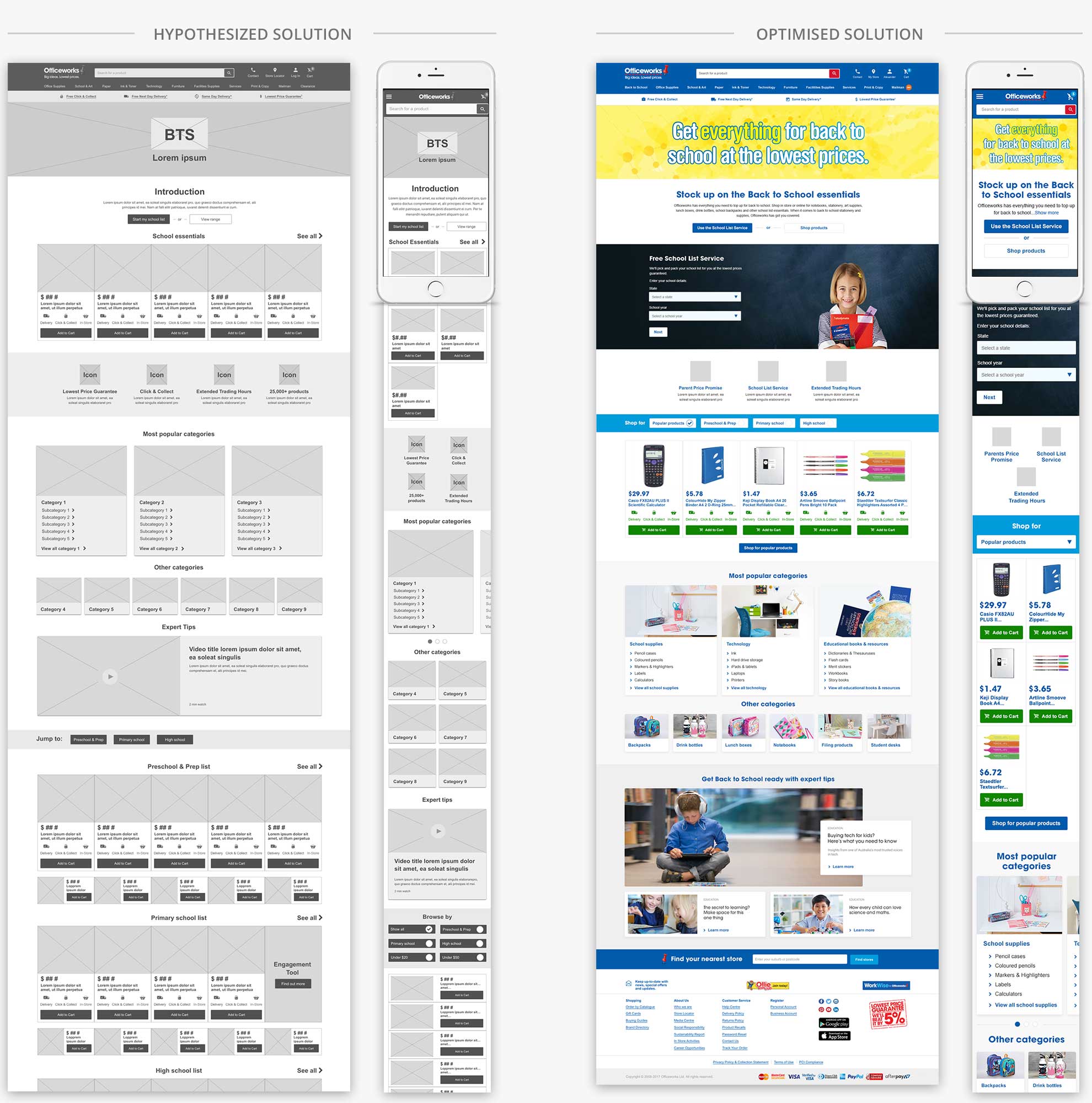
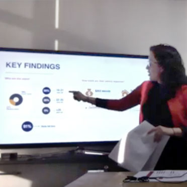
After brainstorming with the paper prototypes, we were able to create hi-fidelity wireframes and visual layouts which were fed into an interactive prototype on InVision for testing with customers. The insights gained in these sessions helped us to refine the designs and deliver an optimised landing page to best practice usability standards.
User Testing
Key User Interface (UI) Patterns
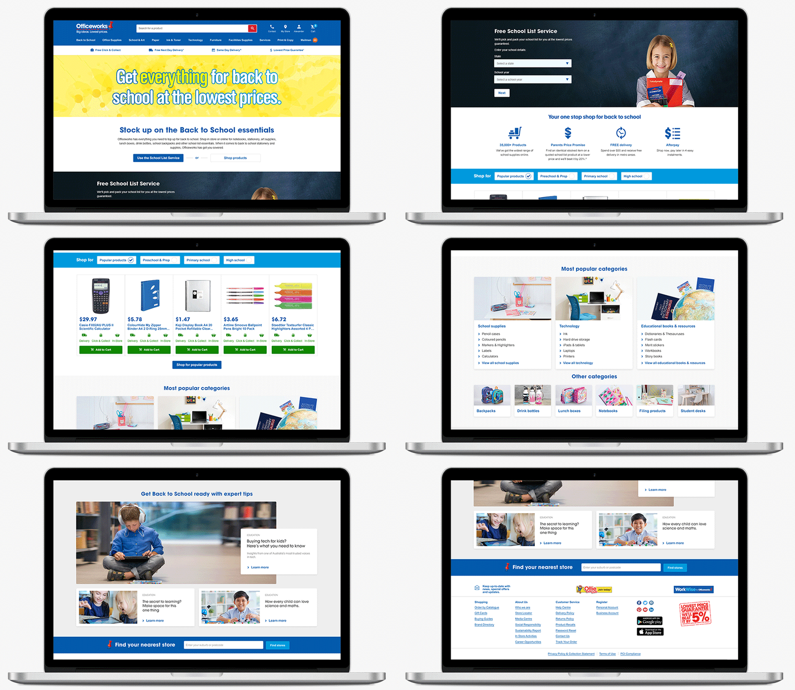
- A full-width layout was proposed to make the landing page look modern and appealing for the customers
- Proof points were introduced to promote the value proposition for each campaign
- A new ‘filter component’ was introduced to help customers to find products of relevance to their needs around price or theme
- To accommodate for the wide range of products, the product component was simplified into three main cards for the main categories and subcategories, followed by 6 more categories
- To respond to the engagement objective, a content component with a hero and 2 standard articles were introduced.
Outcome
Delivered three optimised campaign landing page templates, supported by the findings report. In addition, we provided recommendations for additional A/B testing and data collection opportunities for each campaign.
UX strategy on a tight deadline
One of our challenges was the tight deadline and the number of deliverables we had to do to achieve the project’s objectives. However, we applied our UX process to guarantee its success, as described below:
1. Digital Workshop With The Client
Clarify the campaign landing page’s goals, content and components structure.
2. Research & Design*
Prepare competitors research, user task flows, wireframes, visual prototypes and usability testing
3. Presentation & Design Amendments
Introduce key insights to the client, receive feedback and make design amendments.
4. Assets Handover*
Deliver approved design layouts to Officeworks developers.
*Design Process Optimisation
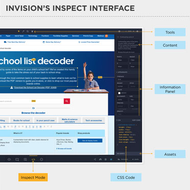
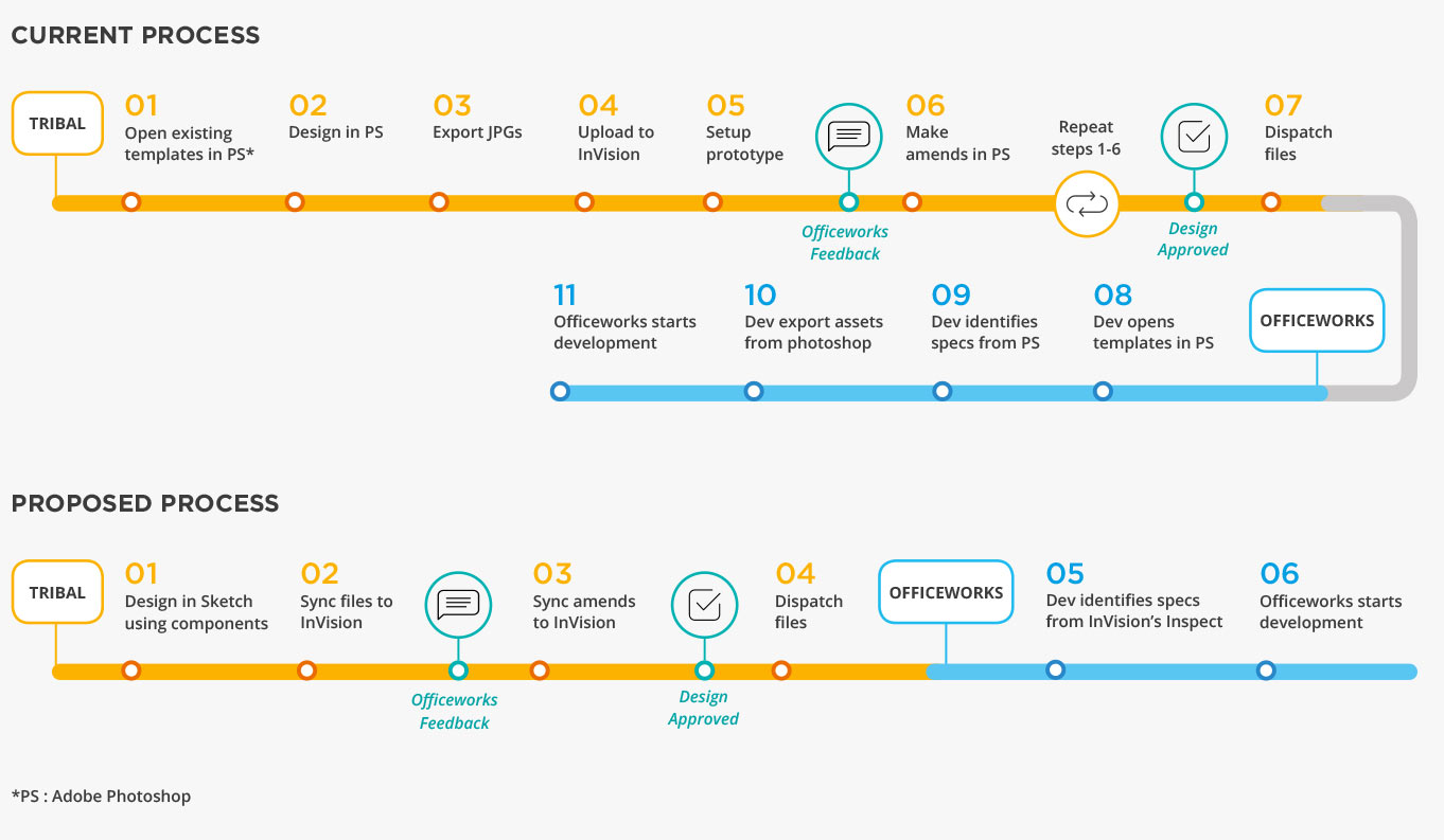
During the implementation phase, I was able to compare and propose a more efficient process and software for the design phase, as highlighted below in the diagram.
By reviewing our current methods and processes, we were able to:
- Organise and optimise the design workflow
- Build a solid design system that can be used for future projects
- Work more efficiently by focussing on the final outcomes and spending less time on the tools.
