Feed Us! - Mobile App
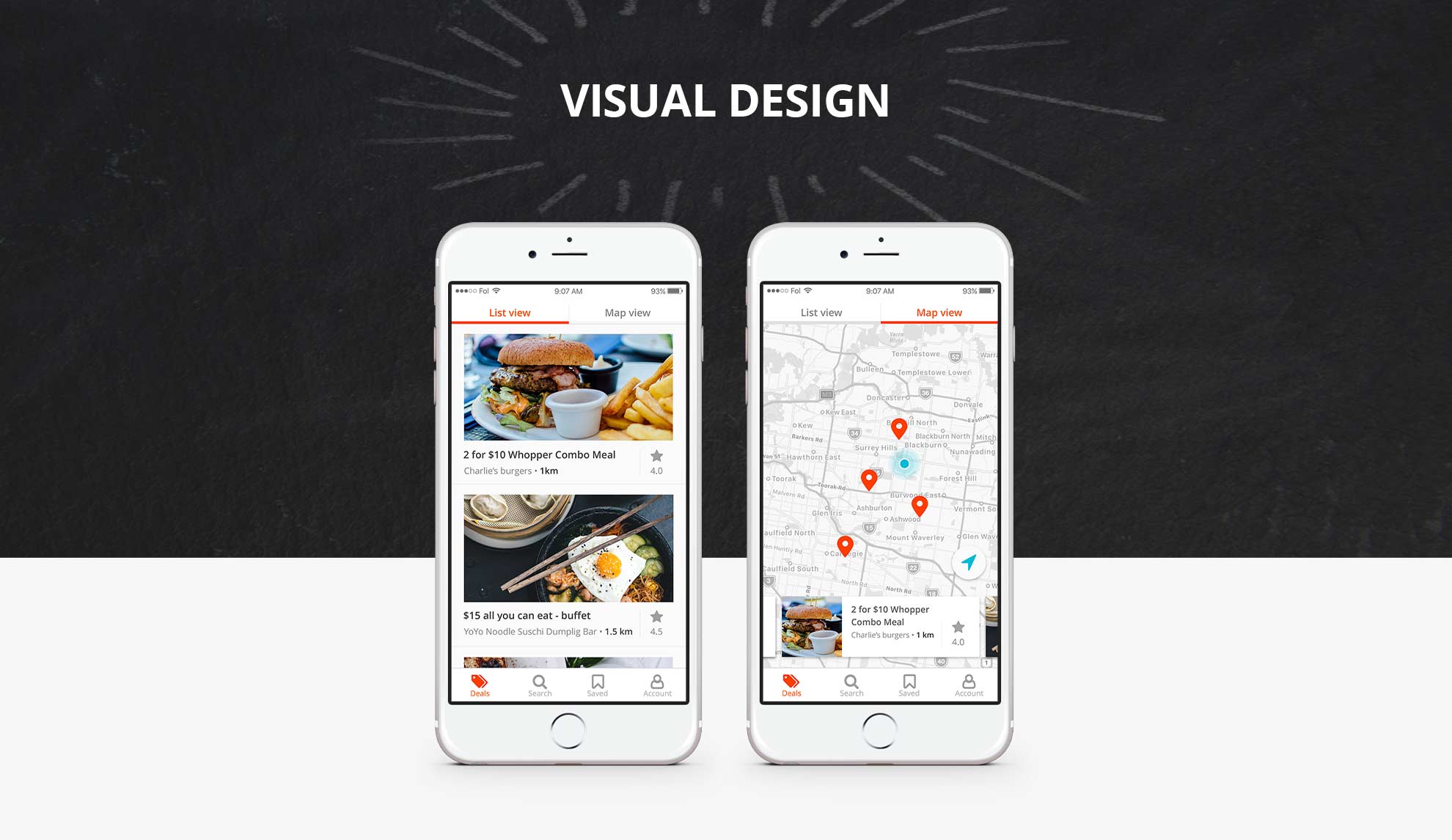
Feed us! is a mobile application that provides exclusive food deals for universities students, who are looking to socialise more often with their friends and save money and time in the process.
This project was part of my user experience course at Springboard, and the result of multiple phases from discovery and design to validation.
Role
- User research
- User interface design
Context
- Most Tertiary students live on a limited income while they are studying
- They need to pay for accommodation, bills, food, transport, entertainment, books and study materials
- They work long hours alongside studying to keep up with their living expense
- Students feel frustrated because they want to go out and have a social life but don’t always have the time and/or enough money to go out with friends.
Challenge
My challenge was to create a solution for these students. They needed to find a way to go out more often with friends and save money and time in the process.
The Approach
I started with a discovery phase to understand the needs, habits and frustrations of international and local university students living away from home.
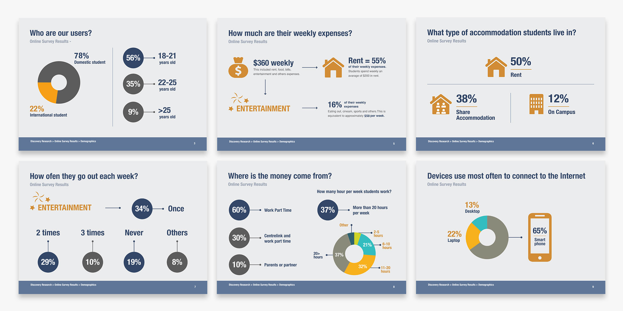
In this phase, I conducted seven in-person interviews at Melbourne University and sent out a survey to gather additional quantitative and qualitative data (the survey reached 22 students).
Key Findings
- Weekly living expenses amount to $360 per week, with 55% dedicated to rent. Leaving $50 (16%) remaining for entertainment.
- 34% go out once a week, and 19% never go out
- 90% work, and 37% work more than 20 hours per week
- 65% use mobile devices to connect to the Internet, followed by 22% laptop and 13% desktop users.
- Most of the students think that it is difficult and pretty hard to manage work and study at the same time. Some have opted to reduce or remove their social life because they don’t have time and money to go out.
“Struggle, Full Time study 3 days a week and working 3-4 days. Don’t see mates for 12 weeks at a time”
“Study on the way to work, on break at work, before tutes, skip lectures and study instead”
“By removing my social life”
- I found that the main factors in choosing where to go out are based on the cost, the proximity, their friends’ preferences and their mood.
“Cheapest place to eat all the time and shortest distance”
“Depending on how much money I manage to save and where my friends are going. Often we’ll end up at ABC drinking cheap dirty cocktails during happy hour on a Friday night”
“How Broke I Am vs how much it will cost”
“What my friends like to do”
Problem Statement
“International and local university students living away from home, feel struggle to maintain their social life, like eating out with friends, because they don’t have time and/or enough money to spend”
Competitor Analysis
I conducted a heuristic evaluation of three competitors to identify usability problems in their interfaces. One notable issue was the absence of helpful functionalities, such as contextual suggestions on the search box while the user type to avoid type errors. In addition, the information did not follow a logical order.
View the heuristic evaluation table >
Heuristic evaluation principles:
- Visibility of system status
- Match between system and the real world
- User control and freedom
- Consistency and standards
- Error prevention
- Recognition rather than recall
- Flexibility and efficiency of use
- Aesthetic and minimalist design
- Help users recognize, diagnose, and recover from errors
- Help and documentation.
Empathy Maps
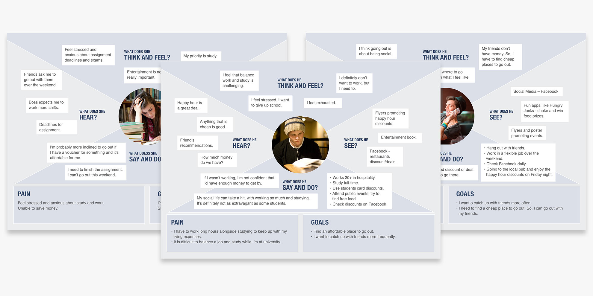
I created empathy maps to understand how the students think, say, do, and feel.
Personas
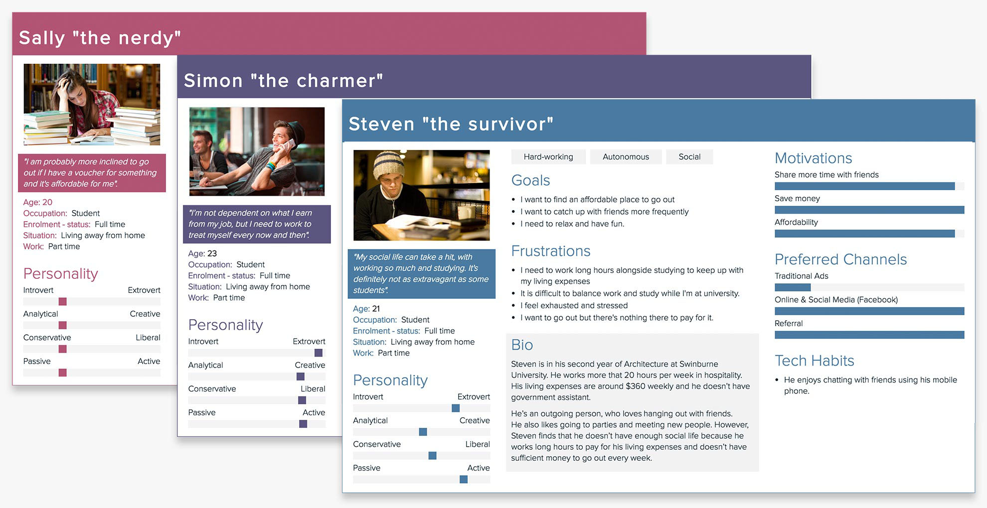
I created three visual archetypes to represent the goals, needs, behaviours and frustrations of a particular group of users.
Minimum Viable Product (MVP) and User Stories
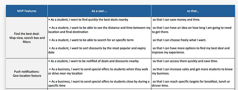
The MVP helped me to validate my product’s hypotheses and the user stories to capture the features that the students would like to see in the app. For the user stories, I follow this template:
As a <type of user>, I want <some goal>so that <some reason>.
View the user stories table >
Content Strategy
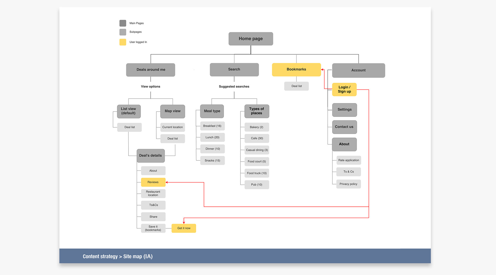
A card sorting exercise was conducted to understand how students grouped content and gain insights into how the labels were interpreted.
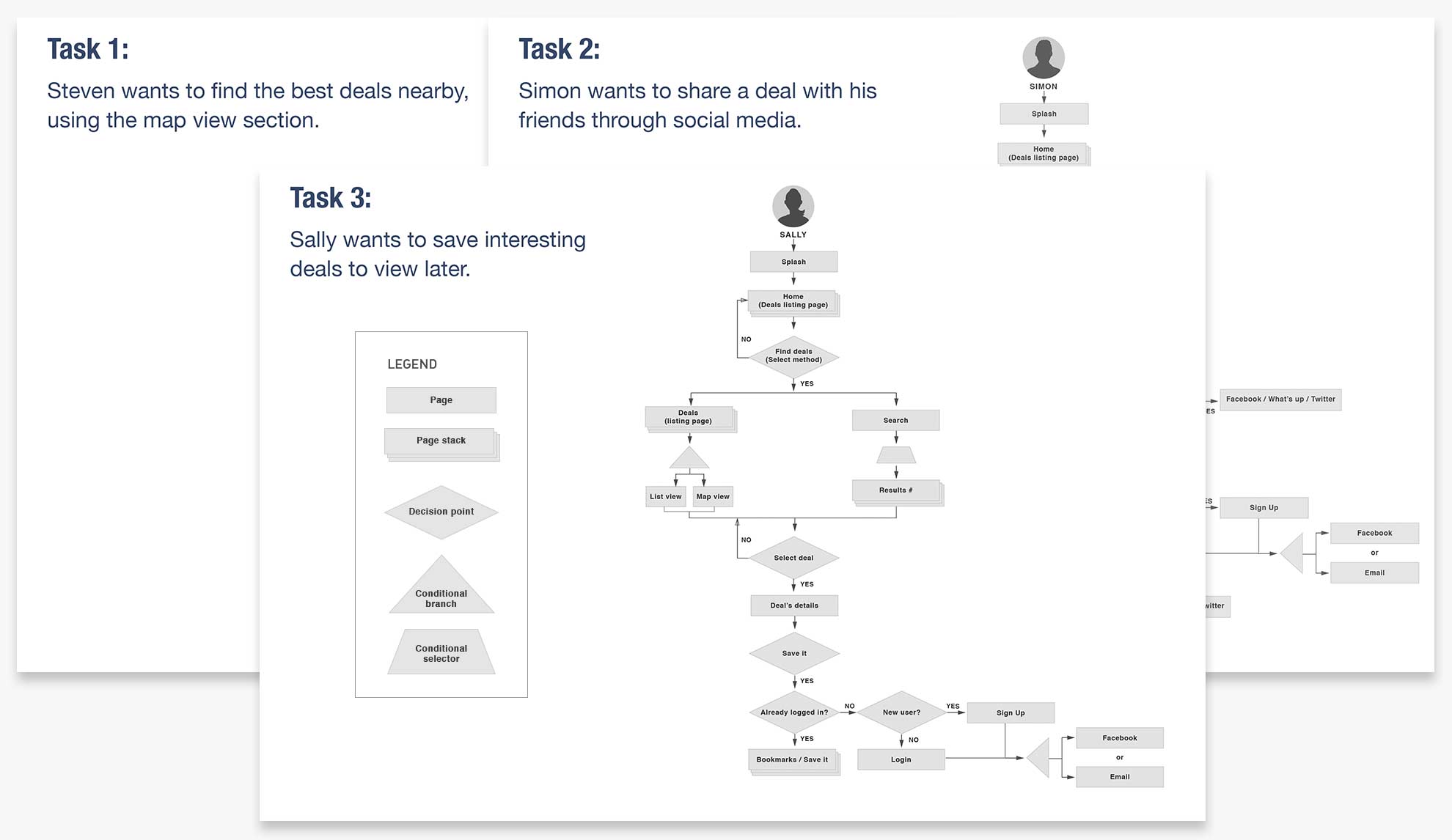
The results of this taxonomy exercise helped inform the creation of the information architecture (IA) and the user flows.
Design Phase
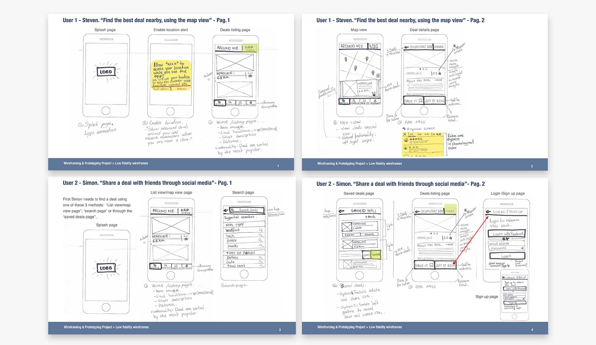
Low-fidelity Paper Prototypes
The prototype helped me to test the design and identify what worked and what didn’t. It also gave me the flexibility to make quick changes.
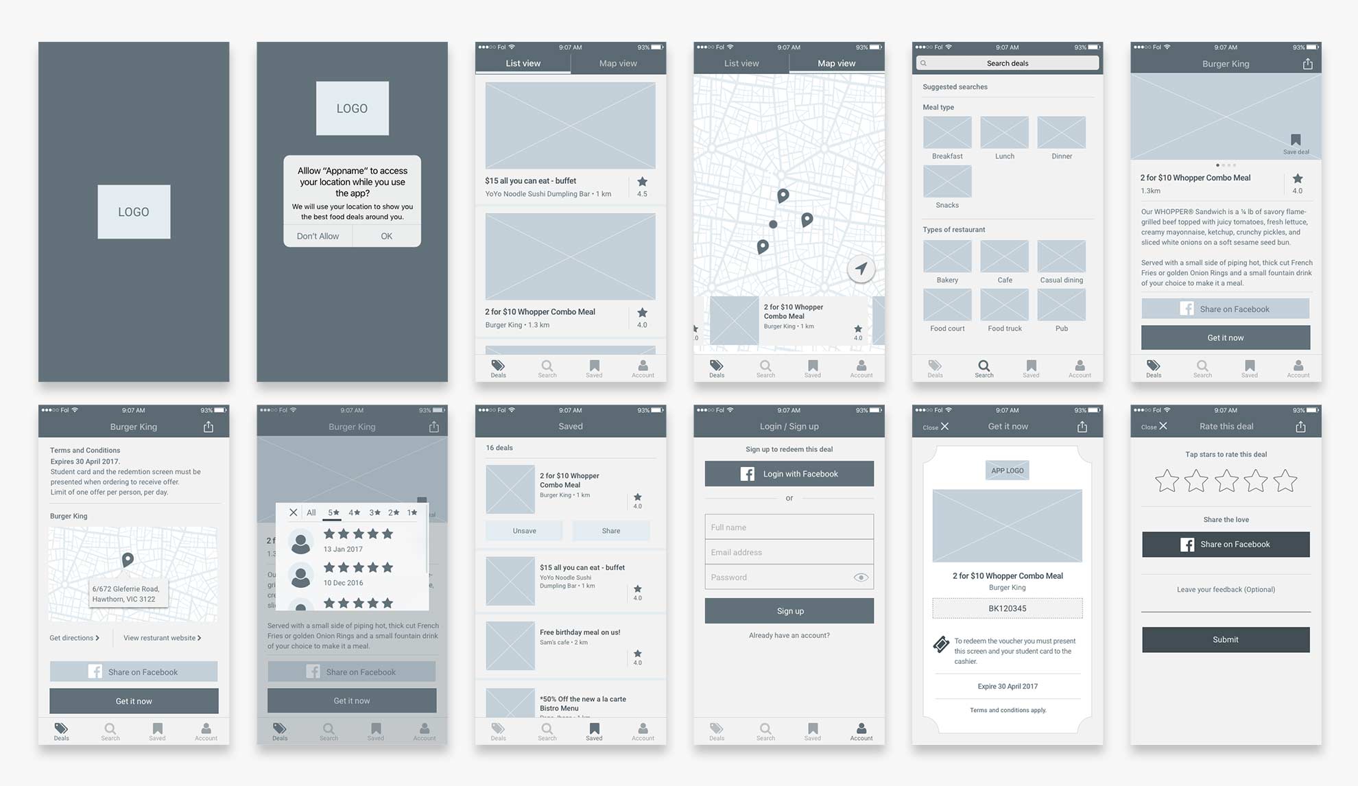
Hi-fidelity Wireframes
For these wireframes, I applied UX best practices, common UI patterns, and actual content to understand the length of the field and the tone of voice for the app.
Usability Test – Prototype Validation
Using InVision I created an interactive prototype using high-fidelity wireframes. This allowed me to test out user flows and get quick user feedback before continuing with the visual design.
“I want to see how many people have voted for this deal”
“On the ‘saved” section, I want to see the expiry date to know which deal is still available”
“The app is cool! I like that I can share deals with my mates on Facebook”
Although limited prototype functions were confusing because some interface elements could not be clicked, the application was clear and easy to use.
Some recommendations for the next iteration were to improve the popover star rating screen and the saved deals page.
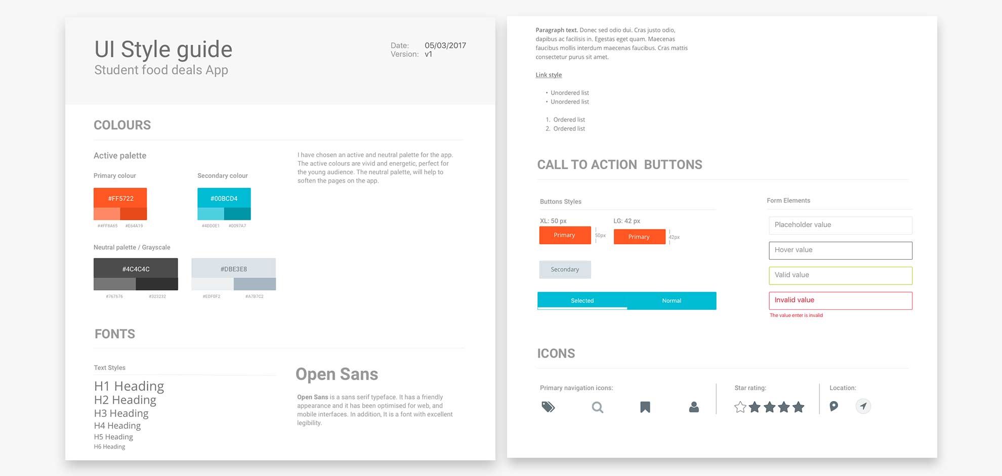
Style Guide
I designed a style guide that complies with accessibility standards and usability best practices. It includes the colour palette, font choice, call to action buttons and icons.
Value Proposition
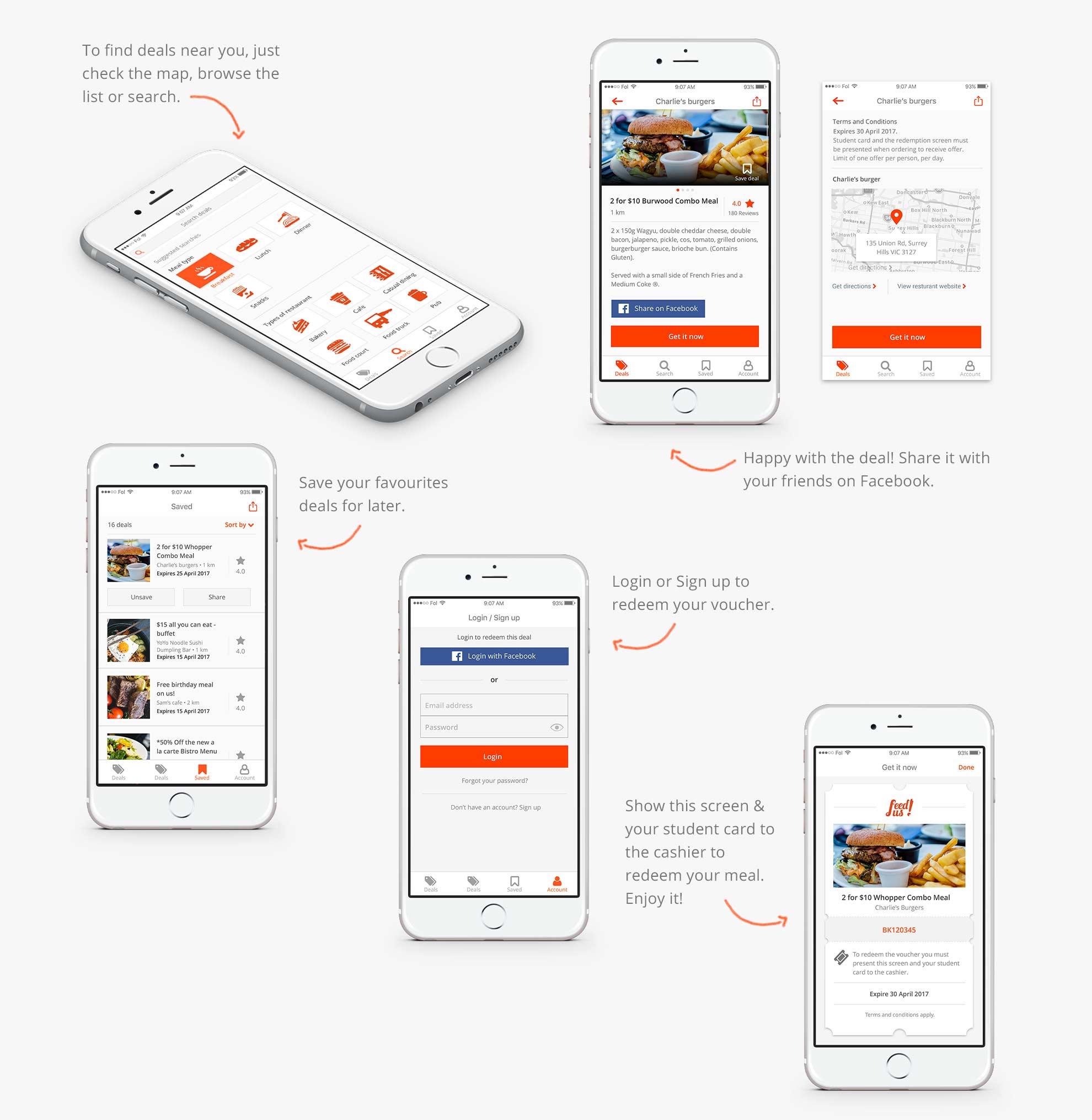
Save time and money when eating out, access discounts and deals, search for offers nearby and share them on Facebook.
